Factory Motor Parts Conference Design
In anticipation of their annual conference, I developed three directions for the overall aesthetic for this global auto parts brand. The three directions showed the contrasting range of directions , which included environmental, logo, badging, and product concept moodboards and designs.
My Roles : Creative Director, Designer
Concept 1 : Retro Angles
Complimenting the brands red and black color palette, the addition of teal brings a distinct and fresh perspective to this years converence. The moodboard includes inspirations from retro illustrations and angular, directional shapes to creative movement and represent speed.

Concept 2 : 80's Glow
Concept 2 takes on an alternative perspective of retro fun, this time being inspired by 1980's colorful graphics. Neon lights and dualistic color tones create an energetic buzz to the concept. The logo has movement and speed as it's projected forward.

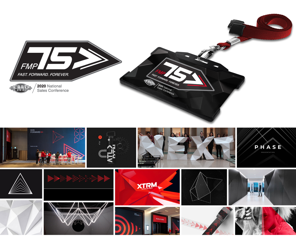
Concept 3 : Modular Facets
Complimenting the complexity of the first two concepts, Concept 3 is a more simplified option. Narrowing in on the color palette allows the graphic angles and dimension to stand out. The logo badge stands apart and provides and opportunity for a contained branding mark.
